“Joel and I were discussing having a website and how it would have been great to launch with it. So I challenged myself to add Docusaurus support. It took just over an hour and a half. I'm going to send you a PR with the addition so you can take a look and see if you like it. Your workflow for adding docs wouldn't be much different from editing those Markdown files.”
— Note sent to the Profilo team
This is the story of the rather short journey it took to create the Profilo website using Docusaurus.
Profilo, an Android library for collecting performance traces from production, was announced earlier this year. The project was published on GitHub with a less than a handful or Markdown files to describe its functionality and no website to showcase any branding and highlight the logo. The task at hand was to turn these existing docs and logo into a website.
In general, when creating a website with Docusaurus you do the following:
- Generate a template website using Docusaurus scripts.
- Customize the generated template files for your desired site colors and your project configuration (ex: website and GitHub links).
- Create the website content:
- Add your docs and any supporting assets.
- Customize the default landing page provided by Docusaurus to suit your needs.
- Configure the default site navigation file.
- Publish the website and set up how it will be published for future changes.
Given I had pre-existing Markdown files, I didn't have to generate the core content but simply make sure that Docusaurus could process the files by adding the expected metadata to them. Most of the work would therefore consist of customizing the defaults provided by Docusaurus.
Overview of Steps Taken
Here's an overview of the steps taken to convert to a website. I'll discuss some of the design aspects in a later section.
Design and colors:
- Got all the desired logo formats from designer. I had to create the .favicon one.
- Worked out some passable primary and secondary website colors using the http://paletton.com/ tools - very handy!
Initial website setup:
- Forked the Profilo project on GitHub and created a local clone of the fork to set up the website.
- Created the initial Docusaurus website using the installation instructions.
- Deleted the
docs-examples-from-docusaurusandwebsite/blog-examples-from-docusaurusfolders as these would not be needed. Profilo had existing docs we could use and there was no need for blogs at this time.
Content creation:
-
Added metadata to the existing Markdown files found in the
docsfolder, for example:---
id: architecture
title: Architecture
sidebar_label: Architecture
--- -
Added the logo assets to the
website/static/imgfolder. -
Modified
website/pages/en/index.js, the landing page, to highlight Profilo features. -
Modified
website/core/Footer.js, the footer, to simplify it for Profilo. -
Edited
website/siteConfig.js(website configuration file) to specify the previously chosen primary and secondary colors. -
Modified
website/sidebars.jsonthat specifies the sidebar navigation. Listed all the docs and customized it based on the metadata added to the Markdown files. -
Edited the website configuration file to specify the GitHub properties, logo images, header links, and the website link.
-
Tested the website locally throughout this phase. (I ran
yarn startfrom thewebsitefolder to start the server.)
Feedback and review changes:
- Sent a pull request to the project.
- Updated the colors after the designer rightly gasped at the ones I had chosen (IANAD).
- Updated the colors and updated the PR.
- The PR was then accepted and merged. Yay!
Website publishing:
-
Pushed the first website version by running the Docusaurus publish script from the command line:
USE_SSH=true \
  GIT_USER=caabernathy \
  CURRENT_BRANCH=master \
yarn run publish-gh-pages -
Configured CircleCI using the provided Docusaurus instructions. There were 2 PRs for this, the firstfor the initial config and the second to make sure CircleCI only triggered for changes in the master branch (thanks Joel Marcey!).
The final website was published on https://facebookincubator.github.io/profilo/. It had taken 1.5 hours to get to the initial PR stage and another half an hour or so to respond to review feedback and publish the website.
设计
Here's what the initial website looked like when the first pull request was sent out:
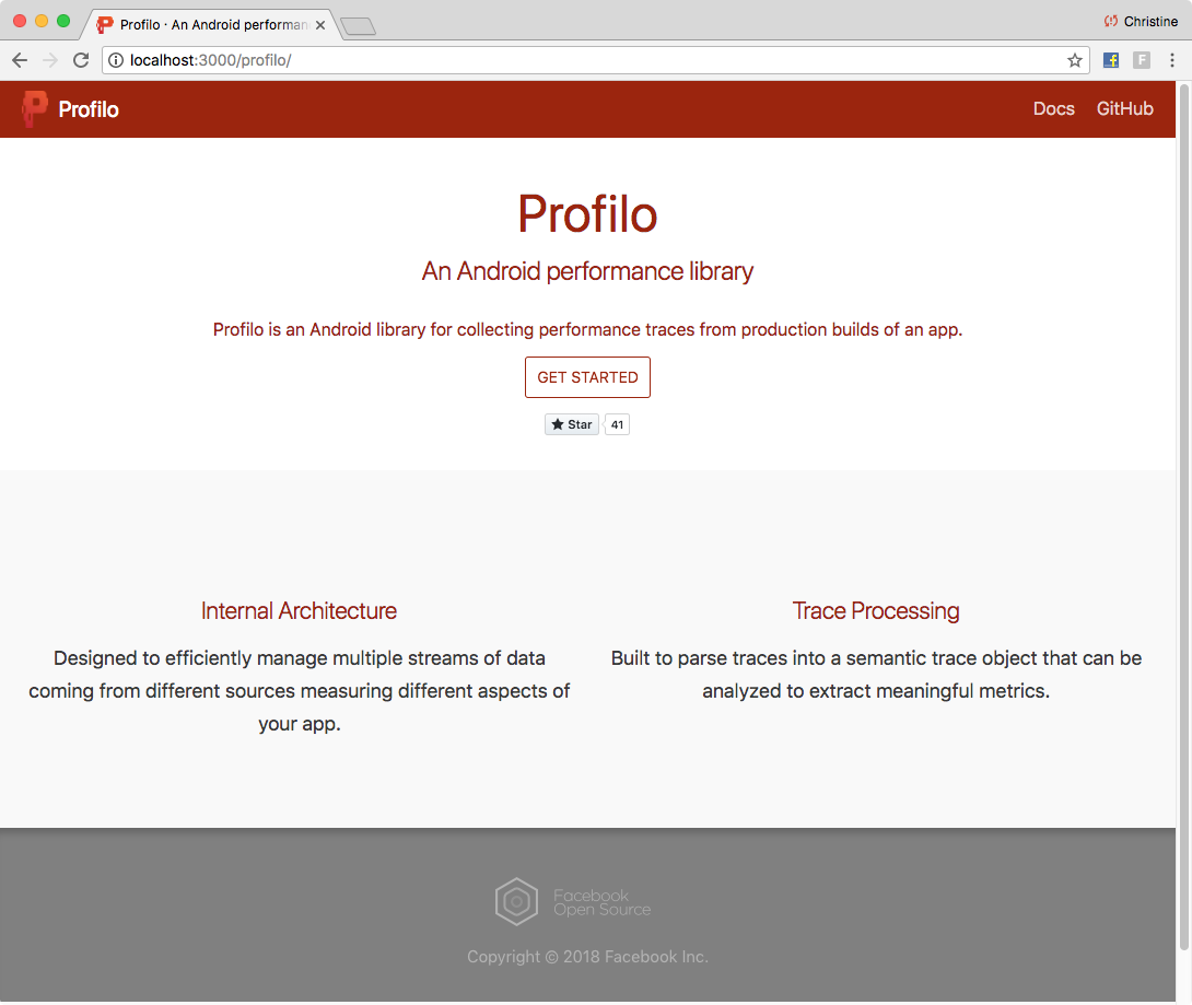
Most of the time in the content creation was spent picking colors that worked reasonably well with the given logo. These colors were a good jumping off point for designer feedback. I used Photoshop to sample various portions of the logo.
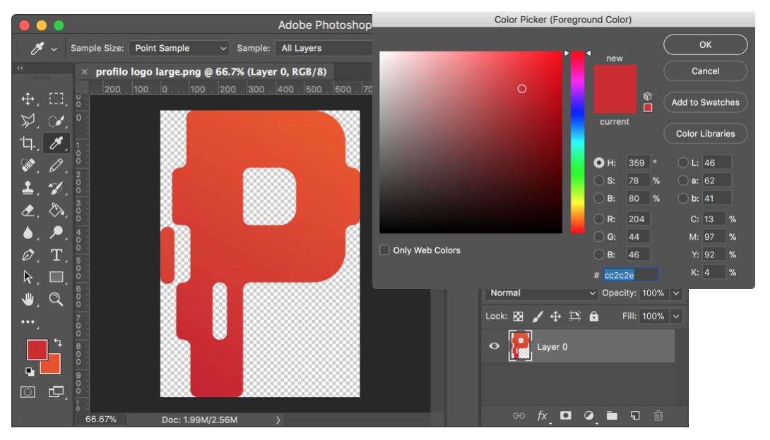
I then took the RGB representation of the color and set it as the baseline color on Paletton. The website then gave me various color options to try on the website by editing the Docusaurus website configuration file.
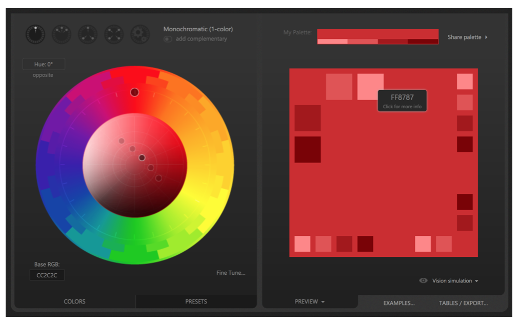
The selected primary and secondary colors were a good jumping off point for designer feedback.
There were also modifications made to the default website generated by Docusaurus. These changes were mainly around simplifying the footer and creating a customized landing page for Profilo that listed the project's features.
Here's what the final website looked like:
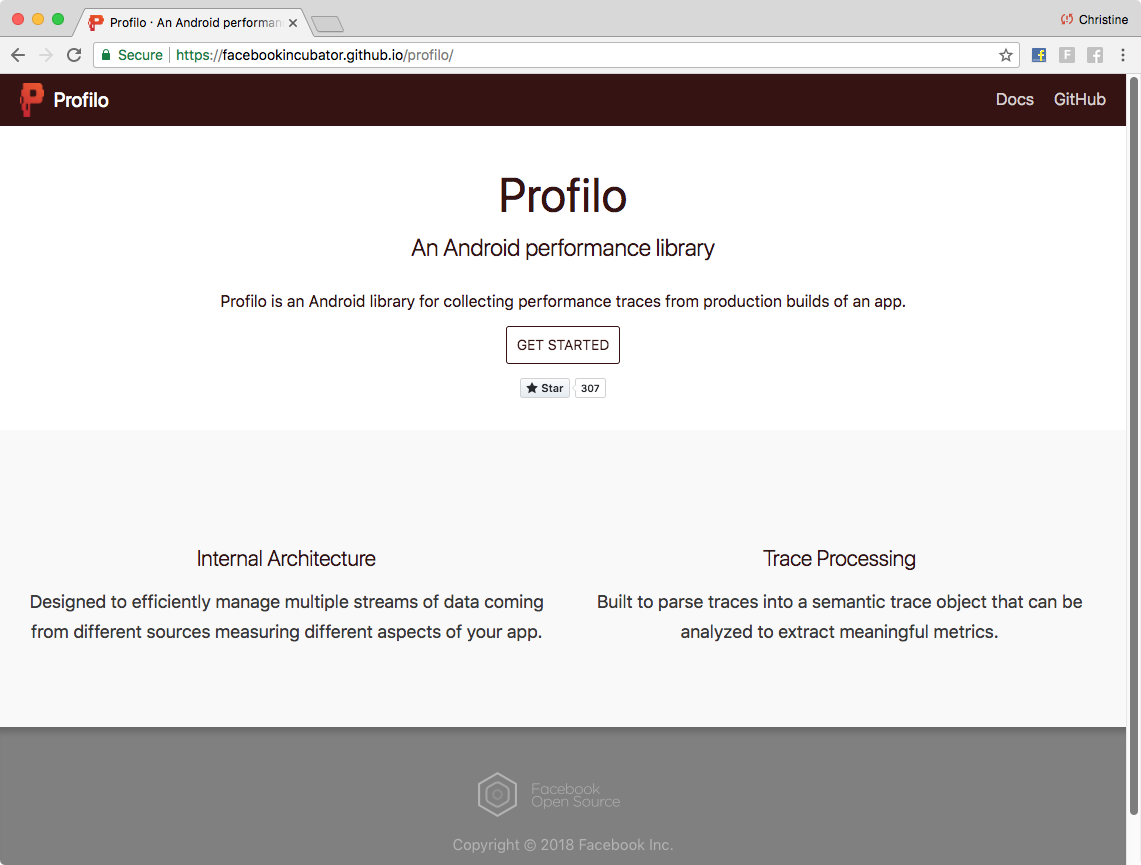
This is an example page showing the core content, in this case the Getting Started page:
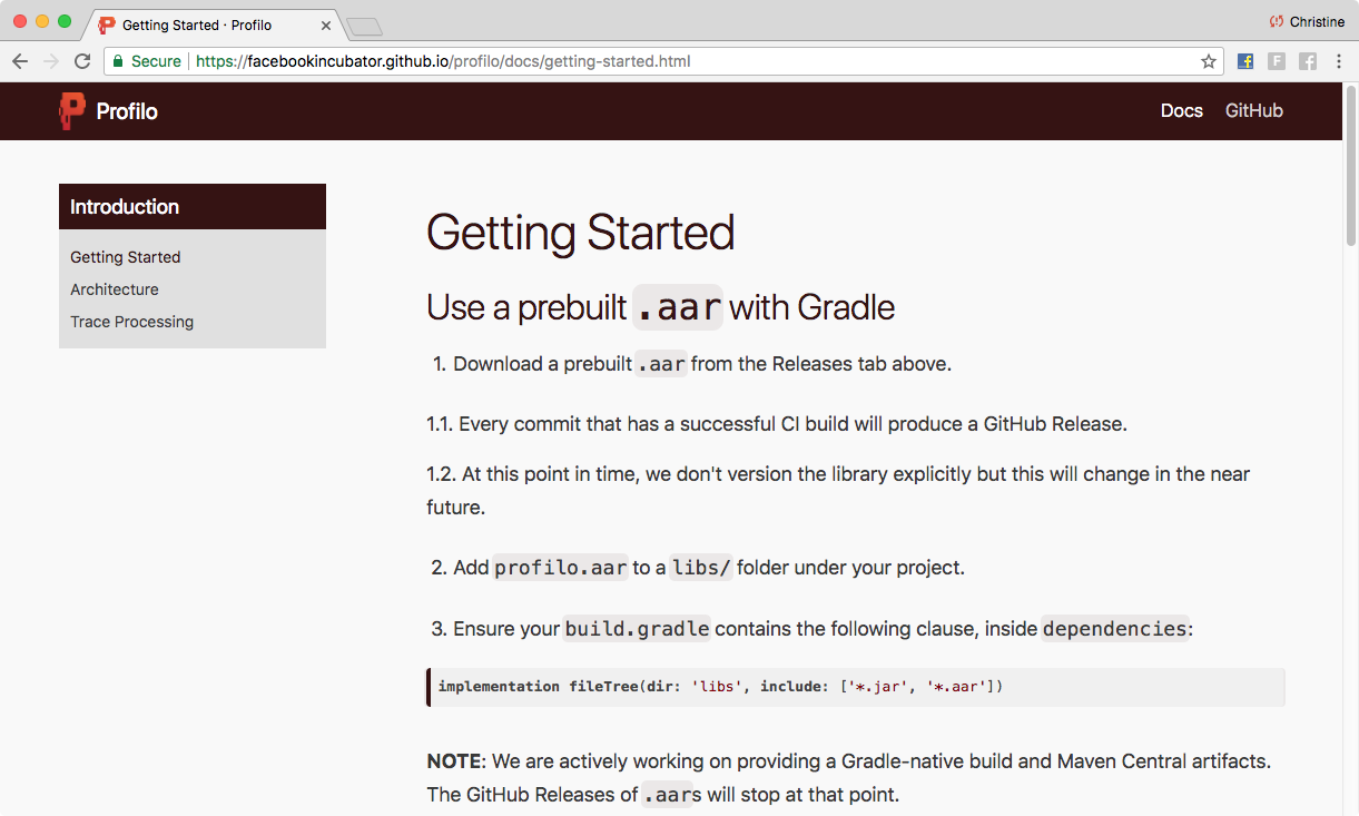
This also shows the sidebar structure that was set up through editing website/sidebars.json.
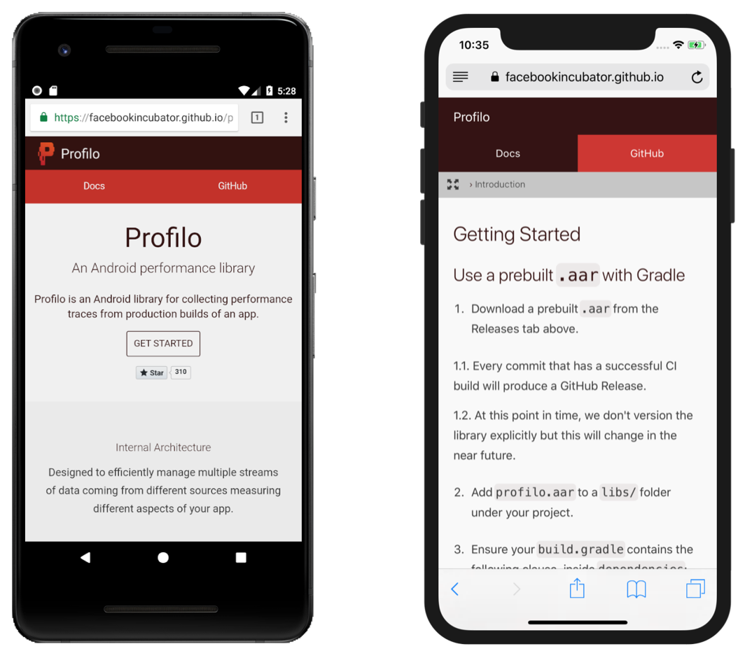
Lastly, I didn't have to worry about handling responsive design. You get this out of the box with Docusaurus!
Final Thoughts
The Profilo engineers were happy to see that they didn't have to change their workflow to update existing content. They were able to continue working with Markdown files. This will still be true in the future if new docs are added, although there may be some config changes needed if the sidebar navigation needs to be updated.
The infrastructure provided by Docusaurus made it easy to convert Markdown files into a working website. Even though the project had only three docs, this gave Profilo a more professional look. So, it was well worth the short time investment to get it done.
